

Why Restaurant Uniforms Are a Bigger Decision Than They Look
A staff uniform tells guests who you are before anyone speaks, and it has to survive a full shift of real physical work. Getting both right is hard.

Linens, glassware, and table spacing are easy to treat as decoration. Guests notice them more than owners expect, often before the first dish arrives.
A staff uniform tells guests who you are before anyone speaks, and it has to survive a full shift of real physical work. Getting both right is hard.

Lighting shapes mood, appetite, and even how food looks on the plate, and it's frequently the last design decision made and the first thing that gets compromised when a build-out budget runs tight.

A logo isn't supposed to tell a guest everything about the restaurant in one image. Trying to make it do too much is one of the most common mistakes independent restaurants make when building their identity.

Chicken tenders and a side of fries copied onto a smaller page isn't a kids menu, it's a shortcut. A thoughtful one can meaningfully improve the whole family's experience, and the table's spending.

A sign is often the first, and sometimes only, impression a potential guest gets before deciding whether to walk in. Most restaurants spend far less thought on it than the decision deserves.
Not every dish deserves a photo, and not every photo helps. Understanding when menu photography drives orders and when it quietly undermines them makes the difference.

Music influences how long guests stay, how much they order, and how the entire room feels, and yet it's often left to whoever's phone is closest to the speaker. Here's why that's a mistake.
A guest who's stuck deciding for ten minutes isn't being indecisive by nature, they're often being slowed down by a menu that wasn't designed to help them choose.

A dining room can look beautiful and still fight the staff working in it every night. Good floor plan design is invisible when it's right and exhausting when it's wrong.
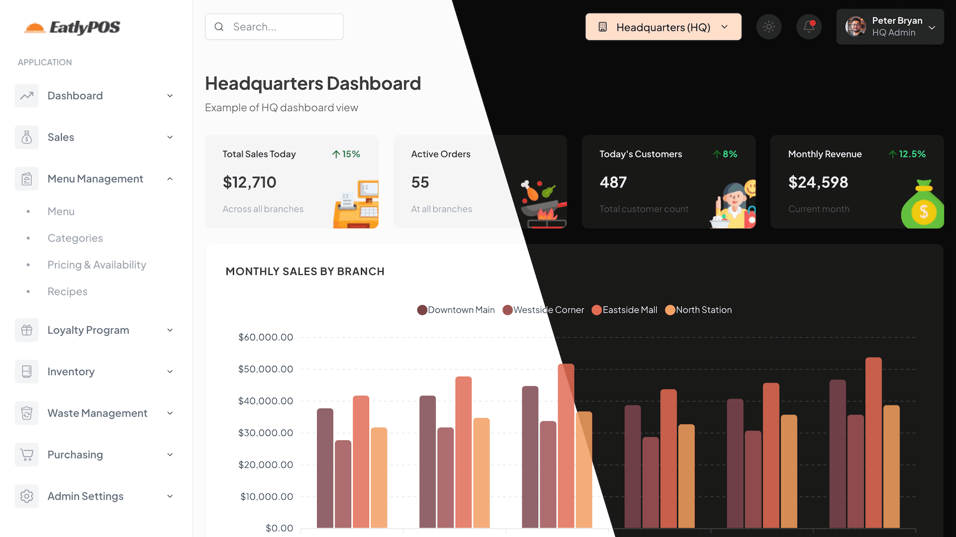
Recently wrapped up a design refresh for the EatlyPOS dashboard, and I'd love to share the process and some lessons learned along the way. The goal was to make the interface feel more professional, visually polished, and above all, more user-friendly.